
Hidden in Plain Sight
Awakening sleeping beauties is such a rewarding part of our work. 105 Duke Street in Ropewalks had been keeping its charms hidden from the people of Liverpool for far too long, and when CERT Property asked us to help put it back on the map, we couldn't resist.
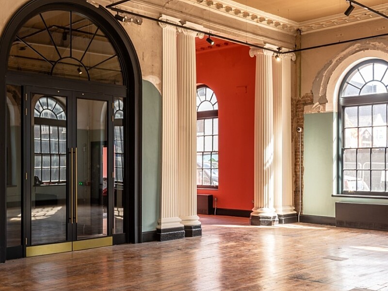
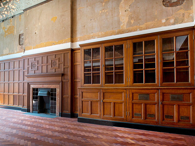
But this was no straightforward renovation. Consisting of interconnected buildings of entirely different characters, stitched together across a corner plot and wrapped in decades of neglect. False ceilings hiding original beams. Partition walls that had swallowed a courtyard atrium whole. The brief wasn't just to restore a building, it was to find the building hidden inside several others, knit them into a single coherent proposition, and convince the Liverpool market this corner was somewhere worth coming back to.

The history made the case. Built in 1800 at the height of Liverpool's seaport heyday, 105 Duke Street was the city's first public library, later home to the Earl of Derby's Natural History Collection and eventually headquarters to Bibby Line, one of Britain's oldest shipping companies. Every layer stripped back revealed another reason to believe in what this place could become.


Rebrand & Reposition
We set about defining a new vision that would reposition the building as a next-generation workplace. Before a single wall was stripped or a ceiling opened up, the building needed a name, one that could carry the weight of its history while making a credible case for its future.
That's a harder task than it sounds. Names for heritage buildings can easily tip into pastiche, rooted in nostalgia, or swing the other way into generic new-build territory that ignores everything interesting about the place. We explored the building's many layers, its civic past, its shipping connections, the streets and stories of Ropewalks. What kept emerging was the idea of two things in productive tension. Two buildings. Two eras. One address.


Duke & Parr was the answer, a name that acknowledges the duality without explaining it to death, and that sounds like somewhere worth going. From there, a full brand identity followed: visual guidelines, tone of voice, a website, animation and a suite of marketing materials that gave CERT Property a coherent, confident story to take to the market while the building was still under construction.


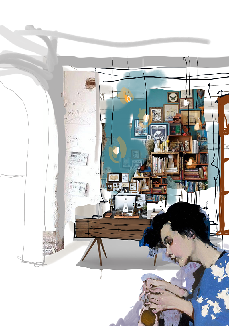
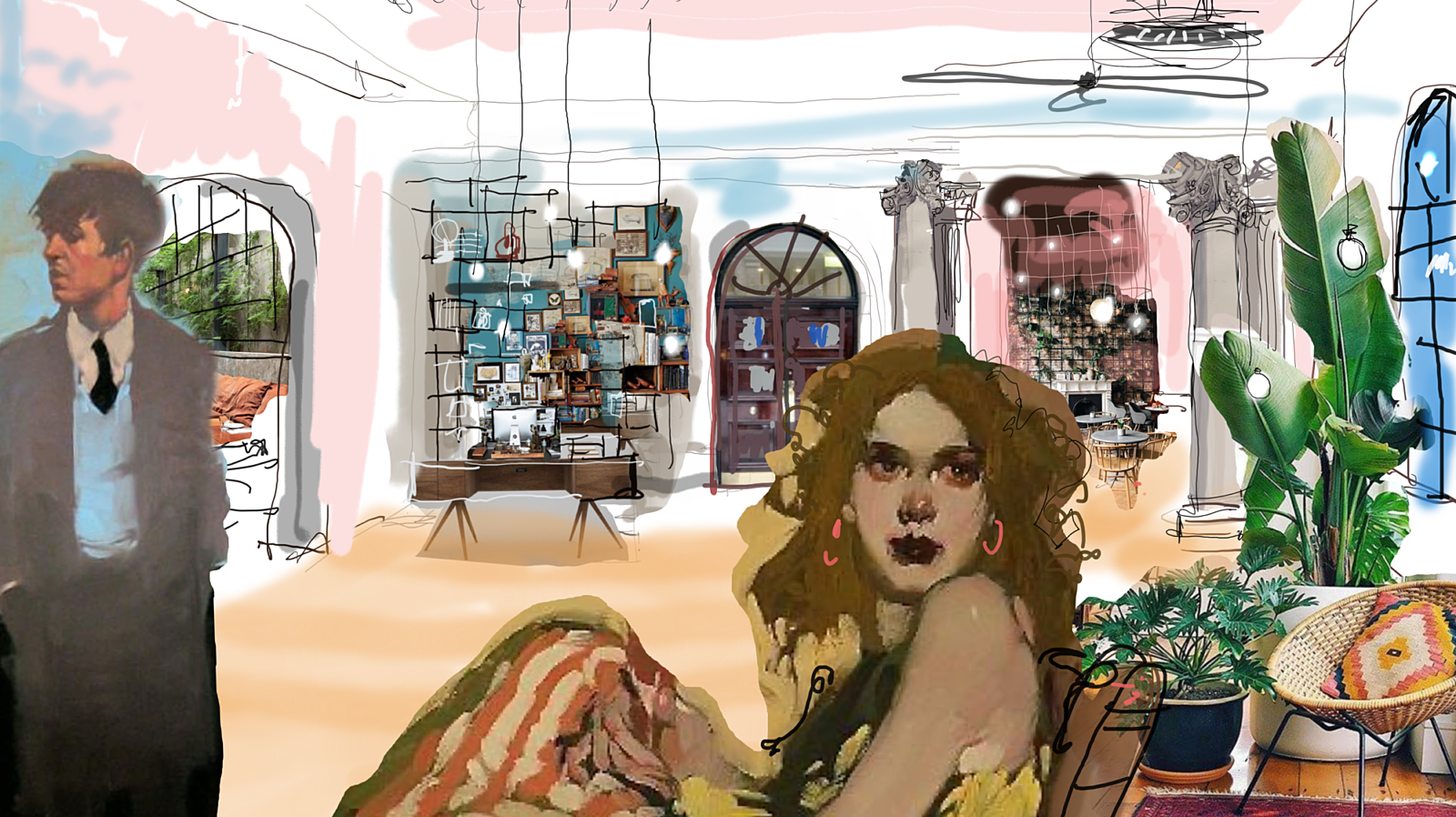
The visual identity drew directly from the building's character, raw, layered, honest. The use of the ampersand in the logo also provided a flexible device to talk about the buildings many features and benefits. We commissioned local illustrator Tracy Worrall to create bespoke wallpaper for the interiors, a piece of place-rooted storytelling woven into the fabric of the building itself. A photoshoot with photographer Drew Forsyth brought the finished spaces to life in a way that felt less like a property brochure and more like a portrait of somewhere genuinely worth inhabiting.
For a landlord trying to let a building that had been dormant for years, all of this mattered enormously. A compelling brand doesn't just help a building look good, it gives prospective tenants permission to imagine themselves inside it. It makes the vision feel real before the keys are even cut.


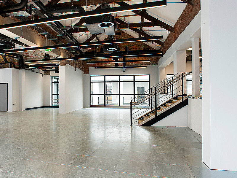
The Space
Rather than treat this as a typical heritage restoration, we took an agile approach, respectfully peeling back the layers to reveal the building's authentic heart, making decisions along the way about what to retain, remove, repair and refresh. Creating connections between the different parts of the building, and between the building and its surrounding neighbourhood, was essential to make it an attractive and flexible proposition for a variety of potential tenants.
The result is 50,893 sqft of workspace across ground floor, first and second floors, and two basement levels, a generous, characterful footprint that feels genuinely unlike anything else in Liverpool. Tracy Worrall's bespoke wallpaper, introduced in the brand phase, carries through into the interiors here, the same thread of place-rooted storytelling running from the identity all the way into the walls themselves.


The Impact
The market responded immediately. Within weeks of Duke & Parr's completion, the entire building was let to Firesprite, the Sony-owned video game developer, on an 11.5-year lease with no breaks. It was the largest commercial letting in Liverpool city centre in three years, and one that sent a clear signal about the city's growing creative and technology economy.
The letting triggered award nominations across every major regional property category, Commercial Property Deal of the Year at Property Week's Property Awards, North-West Business Insider's Commercial Property Awards, and the Insider Liverpool City Region Property Awards, before taking home the win at the Insider North West Property Awards in 2024.
For Liverpool, it was a landmark moment. For Ropewalks, it was confirmation that a neighbourhood already alive with creative energy had found another anchor worth gathering around. For us, it is proof that when you do justice to a building's history and give it a clear vision for its future, the right people will come.
Some buildings just need someone to believe in them first.
