Mambo Italiano
Everyone loves Italian food. Pizza, pasta, ice cream, these are not hard sells. What is harder is launching an Italian restaurant that feels genuinely fresh and contemporary without reaching for the tired shorthand: the red and white checked tablecloths, chianti bottle candles, the gondola prints. The clichés of Italian dining are so deeply worn they've become almost invisible, which makes designing around them both a creative challenge and a real opportunity.
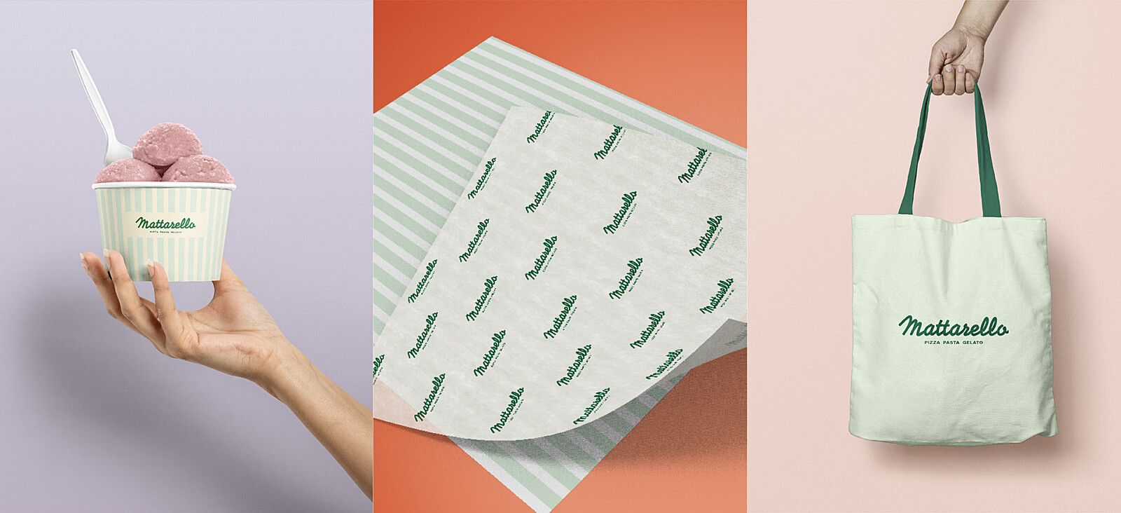
When the team behind Matterello came to us with their concept, a modern Italian restaurant in Manchester focused on pizza, pasta and ice cream, the brief was clear: bring the warmth and soul of Italy into the room without any of the kitsch. The whole package, from brand identity to interior design, to fit out management -from start to finish.
From Amalfi to Trafford
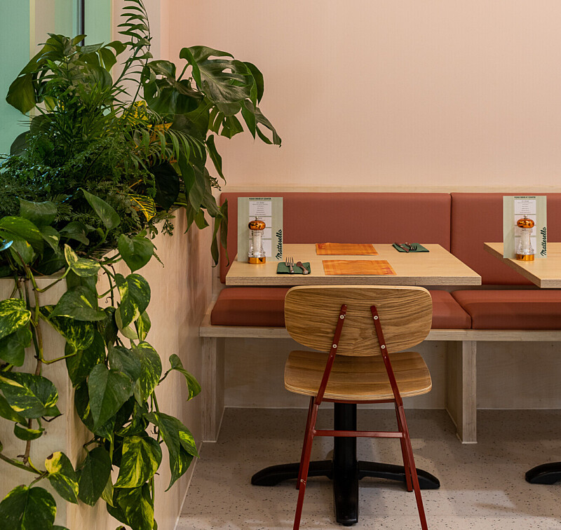
The first decision was also the most important one- colour. Rather than defaulting to the Italian tricolore or the red-and-white of every pizza chain on the high street, we looked to Italy itself, not the flag, but the feeling. The fresh pastels of pistachio and lemon gelato. The warm, rich tones of seasonal ingredients at a market in Naples. The hazy atmosphere of the Amalfi coast on a long afternoon.
From that palette, the brand identity and the interior design grew together, two processes running in parallel from the start rather than one following the other. That integrated approach meant every decision reinforced the same story: contemporary, warm, Italian in spirit rather than stereotype.
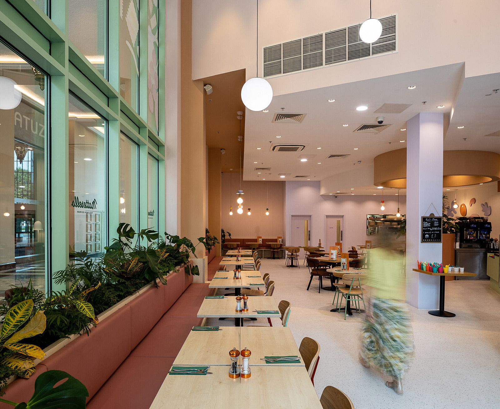
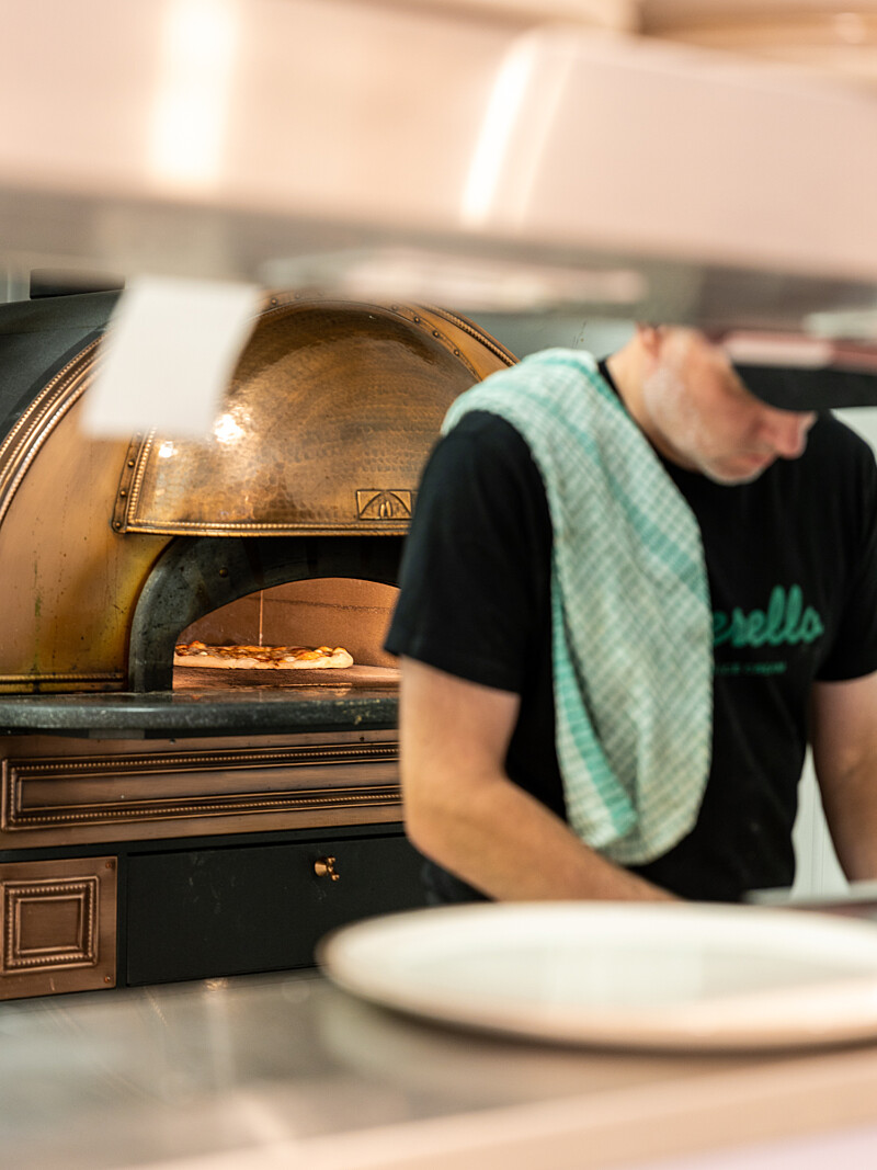
The layout was designed to work hard across different times of day and different types of visit. The ice cream and salad counter sits near the front entrance, accessible to passing trade and grab-and-go customers. Dining for larger groups sits deeper in the space, creating a natural gradient from casual to considered. An open kitchen brings theatre and warmth, making the cooking part of the experience rather than something hidden behind a door.
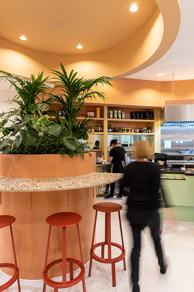


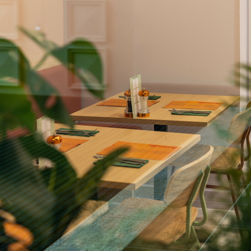
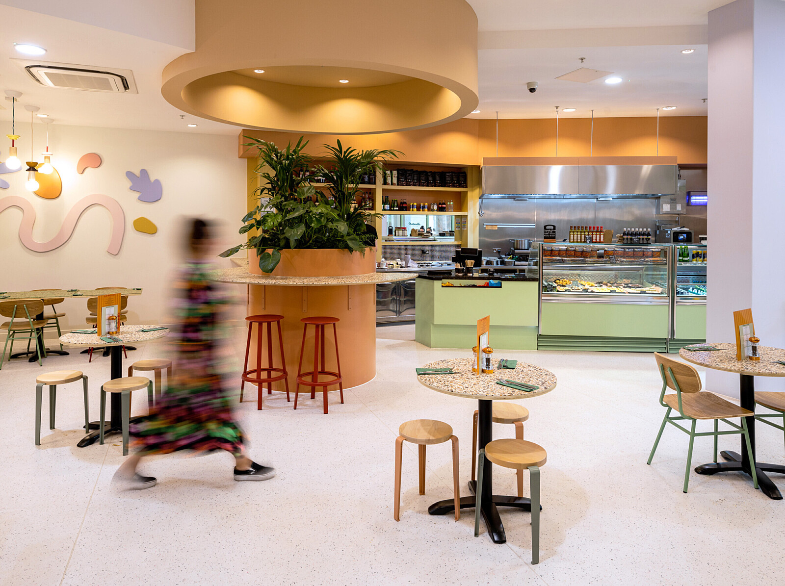
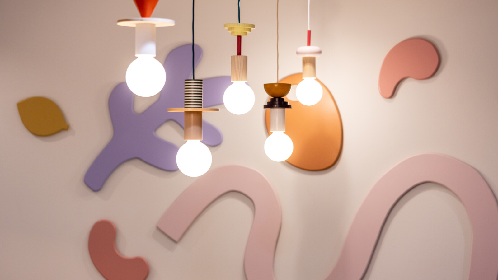
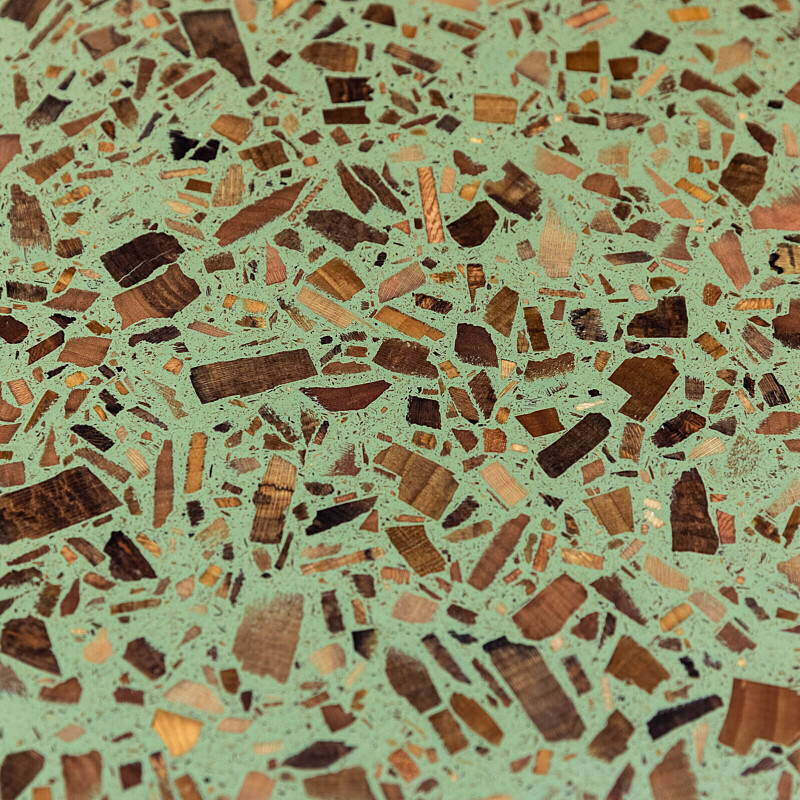
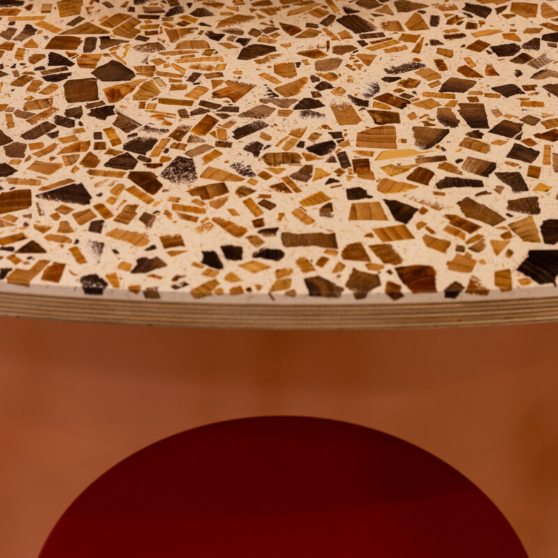
The materiality throughout is tactile and layered, chunky stripes, food-inspired shapes, playful geometric light fittings, terrazzo surfaces and Foresso finishes throughout. Complimentary shapes and textures were drawn out in the furniture and across every surface to create a space that rewards looking closely.
We collaborated with illustrator Han Valentine and artist Mariel Osborn to produce unique window art and bespoke 3D wall features that help tell the Matterello story, details that feel handmade and personal rather than off-the-shelf, in a restaurant sector where experience and atmosphere are increasingly what bring people back through the door.


The Result
Launching a new restaurant concept in a competitive city is never straightforward. What Matterello had from day one was a clear identity, a brand and a space that knew exactly what it was and what it wasn't. No clichés. No compromises. Just a genuinely confident, contemporary take on Italian dining that looked and felt like nowhere else in Manchester.
